
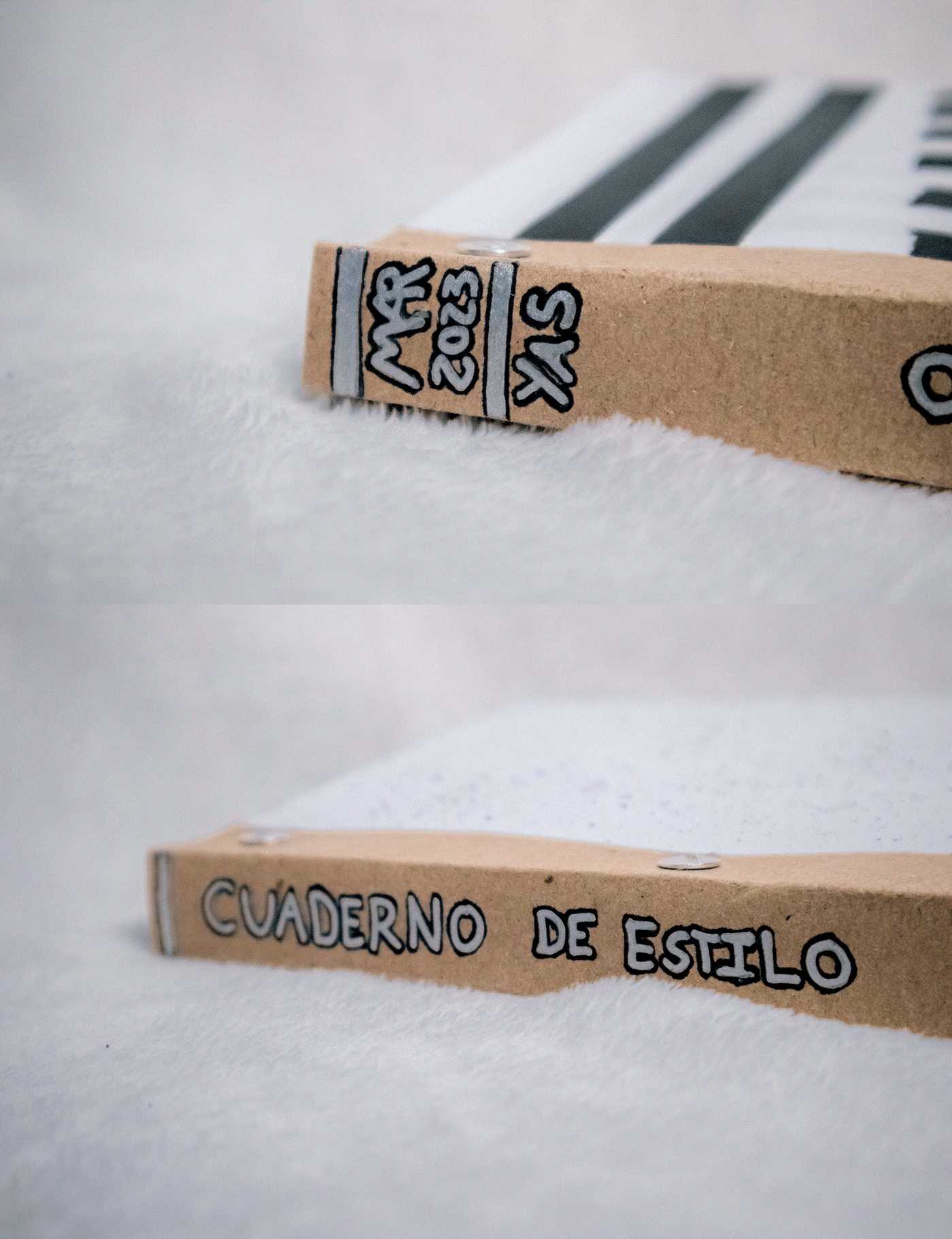
CALLIGRAPHY STYLE SKETCHBOOK
This is the course project I made for: Creative Calligraphy: Find Your Style with a Sketchbook by João Varela
Also, I leave you the link to my shop on REDBUBBLE, in case you are interested in any product with these designs.
Pointless Graffiti
This was a lot of fun to do, once the first line was done I just knew the rest would look like graffiti, and even though the marker was missing ink, I'm happy with that effect, it gives another meaning to "it's useless" for an old marker.

Runes Notebook
This is the result of combining straight lines with curved lines and resembling letters, even if they are not.
This was very eye-opening, as I'm a writing system builder myself, and this technique helped me come out of creative blocks, which happens to me more than I'd like to admit.

Ri Aihro Mahr
When I was finishing the project, I got myself some sponges and said; we're going to do more things, I cut a shape, and without thinking of something specific I got these two letters: "Ri", the problem was that it's not a word in almost any language that I know, so to give it context I used it as a brand name for a fictitious alcoholic drink "Aihro Mahr", and from there it I resembled a language created from those sounds (something that I also do as work).

Desdoblando Glifos
This was also part of the technique of making meaningless glyphs, but I really liked them, and their consistency made me want to use them here: creating an app that supposedly analyzes them, as if it were an ancient writing system.

Christmas Saranghaeyo
There was an oil palette knife that I have never used since I do not usually paint in this type of paint, so I decided to put it in ink (which after going to all corners of my city I was able to get) and write the word 사랑해요 (" I love you" in Korean), what I did not expect is that due to the metallic material of the knife, it would jump when the stroke was raised and create a circle in the letter ㅇ of 요, thus making a circle inside of another circle that perfectly closed the letter. Something I also liked about using this technique was that all the splashes were done at the time of writing, I didn't add any myself.

AX Notebook
Definitely one of my favorites, the funny thing is that I was not trying to create Latin letters, instead, I have a writing system that I invented in which I wrote KOABS (word that means Laughter in one of my languages), but coincidentally when I turned it over, the letters AX were clearly visible, and so it stayed that way.

Guitar Style
Here I began to gather more than one instrument to make textures. The word Style itself means a lot, I wanted to convey its meaning and instead of being the typical idea of super stylized calligraphy, I wanted to show that you can be elegant without being pretentious. I don't know, something very experimental; the guitar was because I was running out of ideas haha.

Personal
Here I wanted to use one of my writing systems, which is called Daveg, it's very personal, I use it to talk to myself, but I've only revealed it to my close friends. I usually write in Spanish with it, but sometimes I use whatever language comes to mind. It was very nice to look for different ways to write in this system that is so important to me, I will definitely look to continue developing styles for my systems.
Lines
Now I added a white gel pen, to generate contrast between the same writing flow, here I had a lot of fun, I made several sheets with this style, where I began to realize that I like to use that contrast, this "mix media" really represents my way of writing. I'm happy to try it on this scale, I'll look to develop it further, and I'm sure my distinctive style will go this way.

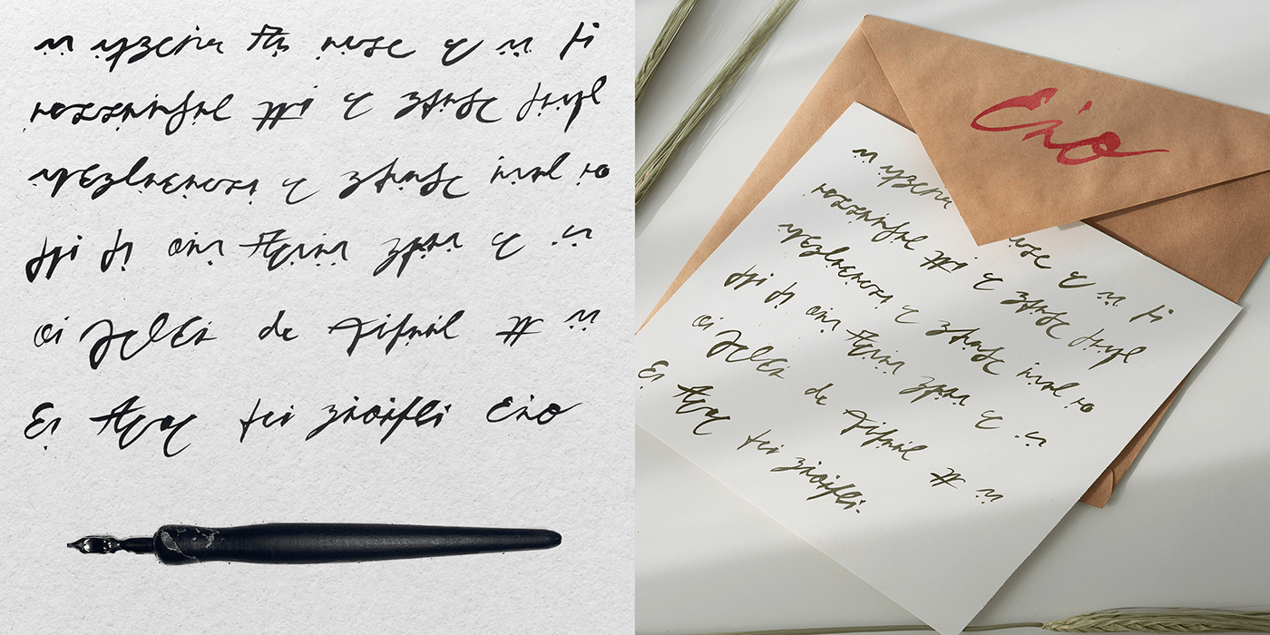
Neon Feather
I have had this pen since middle school, a little over 10 years ago. I used to write in those times with this and another feather that I don't even remember how I got. I myself cured and cut them so that they have the shape that I considered would make me write "prettier". I haven't used it for years, and I decided to use it here because for me it represents all the time and work that I have dedicated to writing, to calligraphy in one way or another. This makes me happy, it makes me feel expressed, and although there may not be clear letters, words, phrases or paragraphs, for me they are the representation of my own downs and ups.

FINALLY THE STYLE SKETCHBOOK
I really enjoyed this process and I will definitely be making these more often for various calligraphic inspiration purposes.
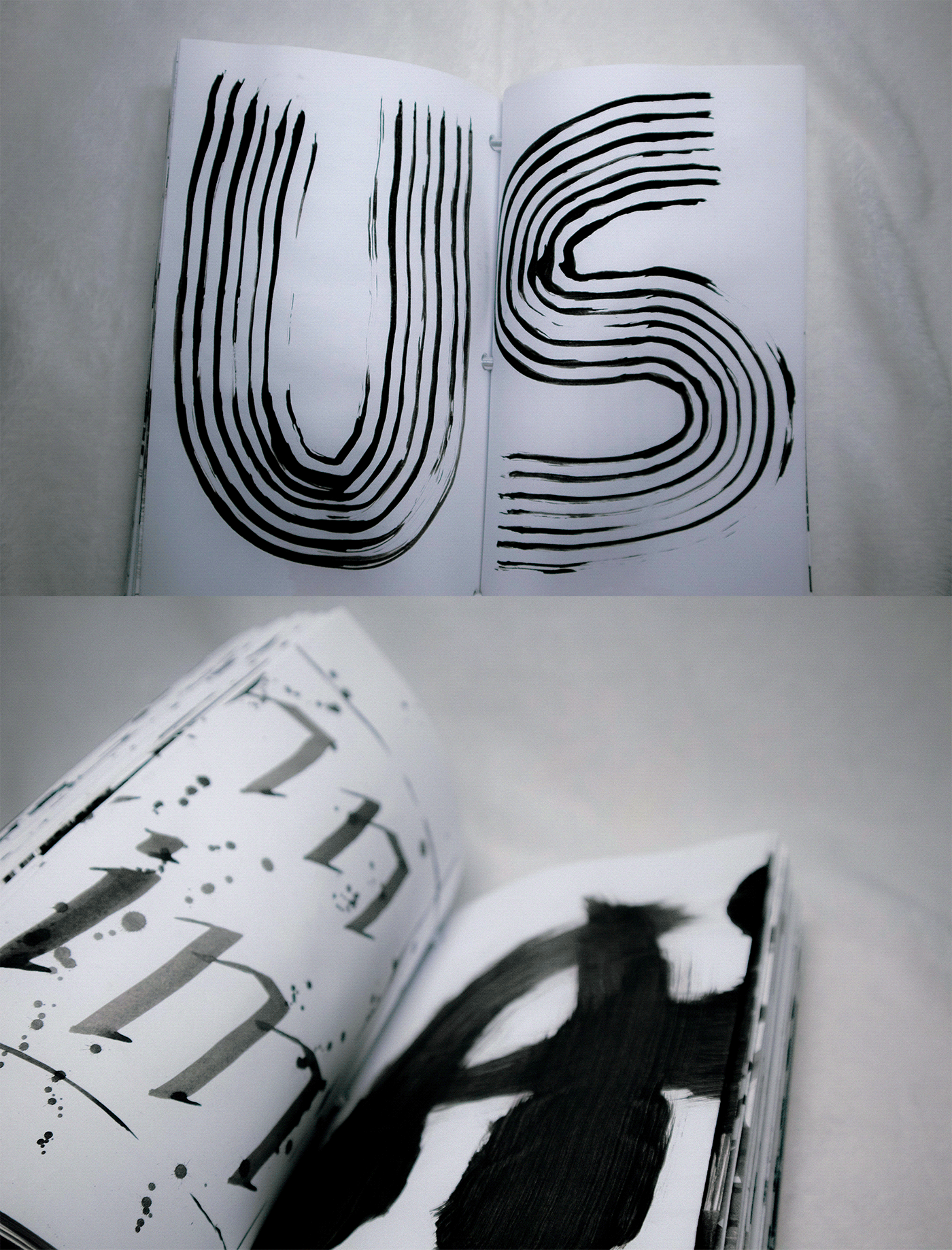
Here are some of the pages from my sketchbook.
Here are some of the pages from my sketchbook.


THANK YOU
I invite you to follow me and leave a comment, all feedback is welcome!
Remember: Here is the link to my shop in REDBUBBLE, if you're interested in any product with these designs.
Remember: Here is the link to my shop in REDBUBBLE, if you're interested in any product with these designs.


